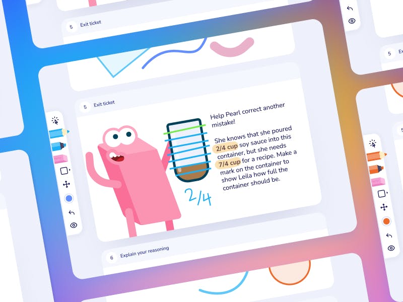
Imagine Learning Classroom
Backpack UI
Design & Dev's Trapper Keeper
- Design ops
- Design Systems
The goal
Reduce inconsistencies between design and developmentOverview
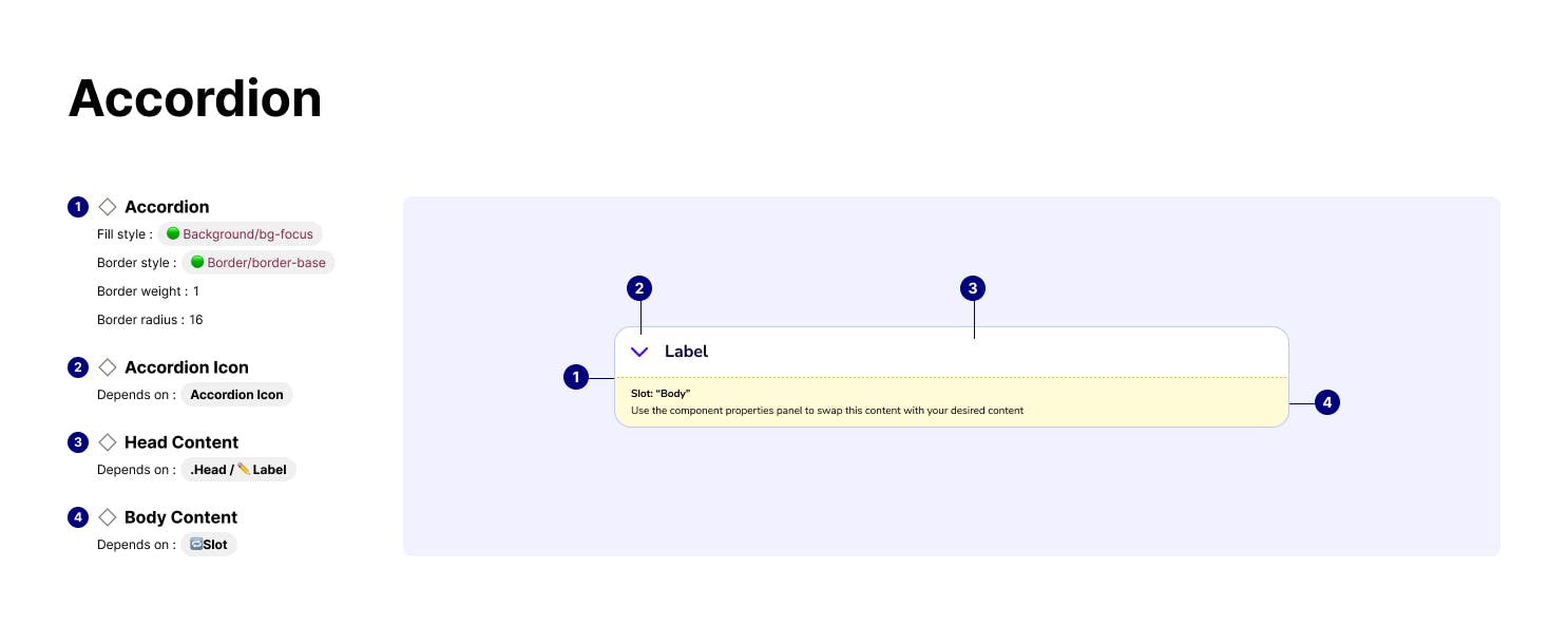
Backpack UI is a Figma component library designed to solve IL Classroom's inconsistencies between design and development, which arose due to a lack of design guidelines and standards.
The goal of Backpack UI is to streamline the design process, reduce design time, and provide clarity about how elements should be built. It was designed to mimic the existing production components, and provide guidance on best practices for future component nomenclature and structure
The Problem
IL Classroom went through a 2-year gap without designers on the team. During this period, many updates had been made to existing web components that were not documented.
When designers were tasked with a challenge, they struggled knowing what components existed and how those components could/should be used.
To combat this, they were designing from scratch or using the inspector to stitch together screenshots to create designs. "Frankencomps" as we like to call them. This led to inconsistencies when building the product because there were no clear rules around... well anything really.
I sought to build a Figma library that reduced this knowledge gap and empowered designers to understand how a component works and the properties that came with it.
Planning
Getting a lay of the land
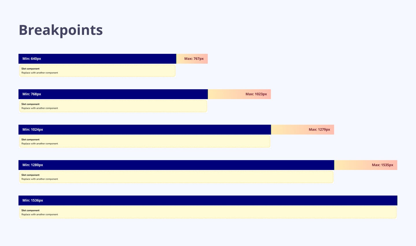
To understand the scope of the problem, I first mapped out the production components and their Vue properties. From this audit, I established a prioritized list of components that would serve as the core building blocks for all other features in the product.
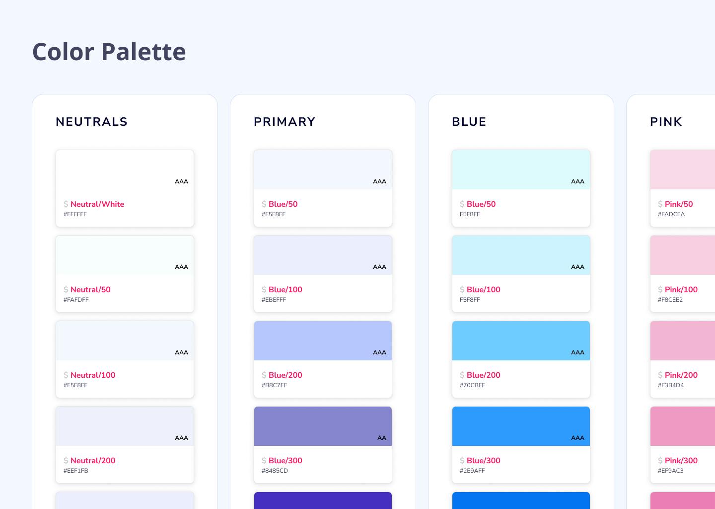
Laying the foundation
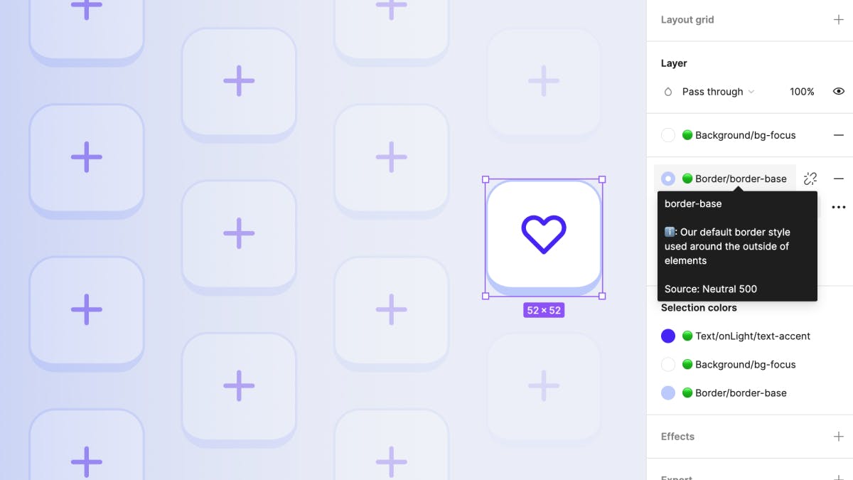
Before diving into building components, I converted our production styles into Figma styles (like color, type, and elevation) into Backpack UI in a way that kept the most common styles at the top of the list.
During this stage, I met with the rest of the design team to refine our production styles. I took this opportunity to establish naming conventions that made sense to designers, but also provided easy access to the tailwind classes that would generate the proper styles.
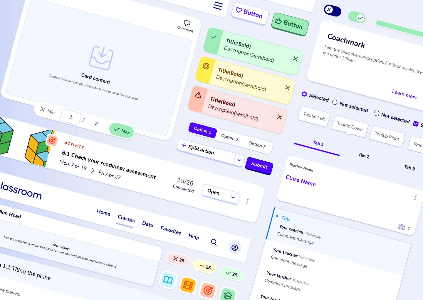
Atoms, molecules, and more
Starting small
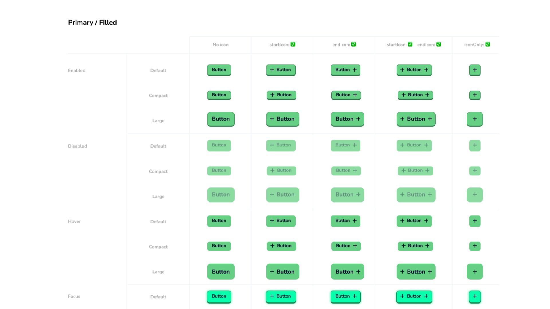
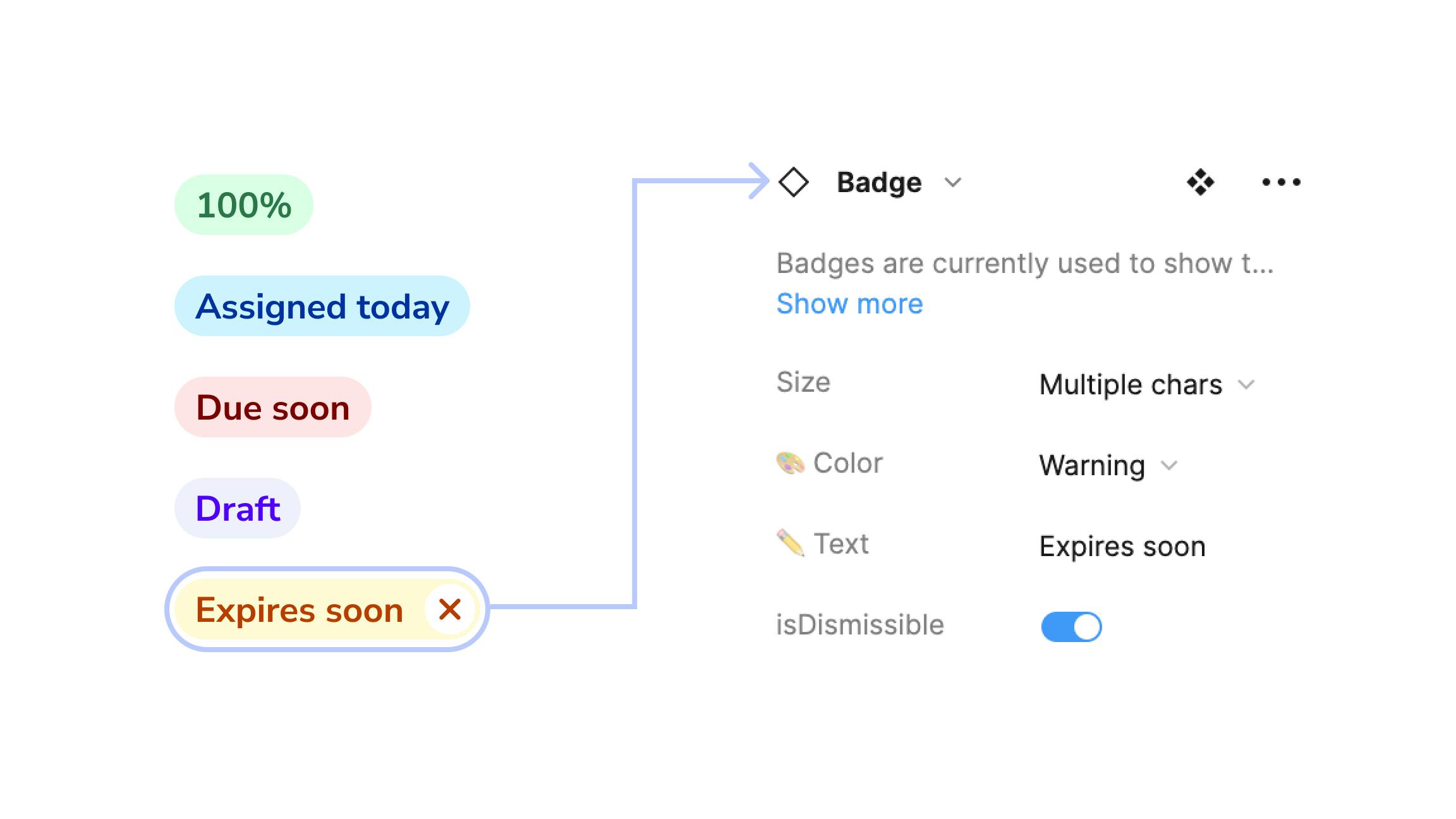
For the initial release, I created Figma components from our 50 "Shared" vue components used in production. V1 consisted of the bare essentials such as buttons, inputs, checkboxes, radio buttons, labels, badges,
This early phase allowed for designers to familiarize themselves with the component structure and their associated properties. The ui-kit consumers stress-tested these core components to identify any issues before moving on to more complex components.
Code parity
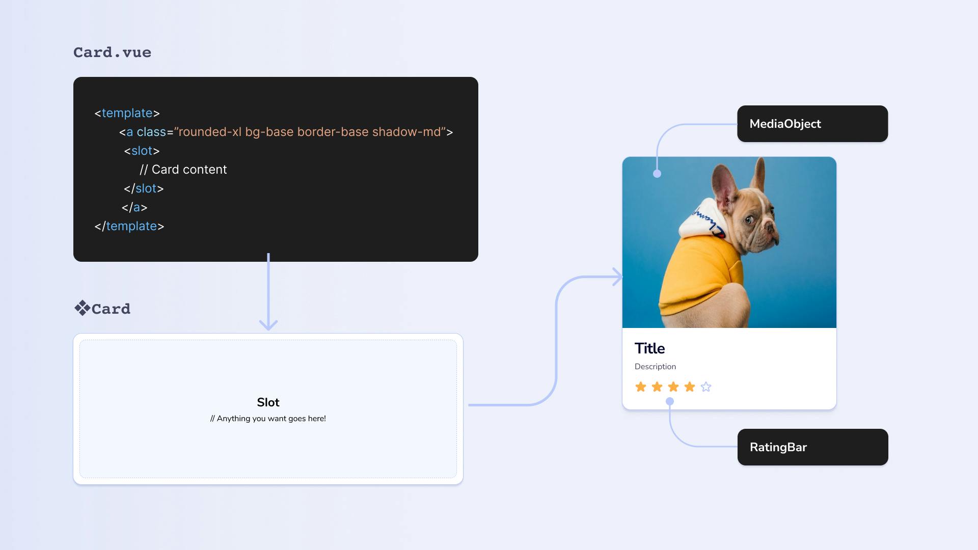
After fine-tuning the core components, I built out the next set of components that were most frequently used in our product and fall under the "Molecules" level of components.
I worked closely with the development team to check consistency in naming conventions of components and their properties. They also tested the components in real-world scenarios to ensure that they functioned as expected.
The results
Ian single-handedly created our Backpack UI system increasing our team productivity, creating consistency across design files and allowed us to create a cohesive brand language for our app
- Peer Principal Product Designer
Ian has gone the extra mile by creating parity between Figma and app code by introducing intentional naming conventions for components and properties that mirror what we see in our code
- Senior Engineer
The work Ian has put into Backpack UI has been a major inspiration for other teams at Imagine Learning. The components are not only well organized and easy to use for both designers and developers, but the way they pair so closely with the code is incredible. Backpack is lightyears ahead of what our other design teams have access to.
- Design ops
Backpack UI has been a huge success for the team. Designers now have a clear set of guidelines and standards to follow, which has reduced design time and improved consistency in design and development. It has helped to streamline the design process by clearly showcasing what components designers have available to them, increased consistency across the product, and drastically improved communication and collaboration between the design and development teams.
The structure and functionality of Backpack UI has received praise from the larger Imagine Learning organization, influencing other design teams approach to maintaining their own component libraries.